Search Options Trading Mastery:
- Home
- Stock Chart Analysis
- Wedge Chart Pattern
Wedge Chart Pattern in Technical Analysis
The Rising and Falling Wedge Chart Pattern
Identifying and trading the wedge chart pattern helps traders to spot trend reversals or trend continuation. They also allow us to anticipate a price profit target as well as new support or resistance areas.
To begin with, let's take a look at the Falling Wedge. This chart pattern is similar in appearance to the symmetrical triangle, in that it has two lines converging towards the apex. Unlike the symmetrical triangle however, falling wedge patterns have both trend lines descending.

In above chart we see both support and resistance lines converging toward each other. You will also notice that as the price action moves further into the wedge, the range of price movement between support and resistance is constantly reduced.
As the constriction takes hold, it no longer becomes profitable for directional traders to enter directional positions within this pattern.
Another typical feature of wedge chart patterns is, that the further the price action drives into the apex, the more the trading volume for the stock will begin to decline. Before this happens however, it's not uncommon to have previously identified the price action as a channel.
A good channel pattern can be traded both upwards and downwards but as the saying goes "all good things must come to an end". If you're well into the channel - and particularly if it has formed 5 or more 'waves' in true Elliott Wave fashion, then you may notice that the peaks and troughs are now converging together.
This is a warning sign that at some point in the near future, the channel will either continue, or more likely, break down.
When we have a falling wedge chart pattern, the falls of the share price when bouncing off the upper trend line will offer better option trading opportunities for a while because they are in harmony with the overall trend, while the upward price action will see increasingly less probability of success because the overall momentum of the price action is still downwards.

Looking at the image above, you'll notice the trading area indicated by red dots will typically have higher volume and consequently, trading put options or short selling will be more profitable.
Trading in the opposite direction, indicated by the green dots, will usually have a reduced level of volume. This is primarily due to the well known fact that a falling share price will have less volume on the pull backs and more on the runs.
The only time you are likely to notice an increase in volume for the upward price action, is when a breakout is in preparation. Falling wedge patterns have a habit of breaking out in an upwards direction and increased volume on the up-swings is our warning signal.
It has been put this way: "A wedge has a habit of breaking out towards the steeper side". When examining this statement it is apparent that the "steeper side" for a falling wedge chart pattern is the upper side, or resistance line. In our first image above, the price action did exactly that - it broke out to the upside.
When a valid breakout occurs you will see an increase in volume and this provides reassurance that it stands a chance of continuing in the short term. This brings us to the behavior of the wedge pattern when it does decide to break out. A wedge does have the tendency of re-testing the line it has just breached prior to going for a run.
Please remember that "tendency" does not mean "every time". So if you only try to trade wedges after the retest, you may miss some moves. Nevertheless, this is a more conservative trading style. It is true that some money will be "left on the table" but entering after the re-test increases the odds of success more than simply entering on the breach.
Another point worth noting is that the wedge chart pattern will usually reverse the direction of the trend. With a falling wedge, the trend has changed once the price action has been breached and closed above the level of the last peak.
If you're trading the re-test, make sure that this trough is also higher than the final trough before the breach, so that you now have a higher low and a higher high. This is your first sign of the new trend and is illustrated in the image below.

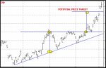
Calculating Price Profit Targets
Is it possible to calculate a price profit target once a breakout from the wedge has occurred? Yes, it is possible and it is as simple as calculating the distance between the first opposite touch within the wedge and the opposite trend line. Once calculated, you simply place it on the breakout point, as illustrated in the image below.

Looking at the illustration, we can see that the breakout almost made the target. Another thing to note, is that this target can become another point of resistance and force the price action back down if the move was too weak.
In our illustrations above this is exactly what happened until the stock managed to gain enough strength, following the re-test, to break up through the resistance level.
It needs to be understood that measuring the potential price target is just that - the "potential" and is not absolute.
Rising Wedge Chart Pattern
There a many similarities between the rising wedge and the falling wedge chart patterns. Both patterns have resistance and support lines which converge towards the apex.
As with the falling wedge, it is just as possible to calculate the potential price target following a breakout - and like any wedge, it may re-test the breached line prior to continuing the reversal.

In our sample chart above, we can see that the price action broke out across the steeper line. With this knowledge, we can closely follow a stock once it has move into a wedge pattern and is being squeezed together. We just wait for the breach and jump on board for the winning side.
An important point for options traders to remember is, that the potential price target is exactly that, so don't be tempted to buy out-of-the-money option contracts simply because the price target is around that level. This form of trading could take you out very quickly should the stock turn and not reach the target.

**************** ****************
Return to Stock Chart Analysis Contents Page
Go to Option Trading Homepage

Popular Articles
-
Near Riskless Trading Strategies
Near Riskless Trading strategies using options, allows you to use advanced arbitrage techniques for highly profitable, almost risk free results. -
Wealth Building Options Trading
 Wealth building options trading - how to profit from share investments even if you buy at the top of the market.
 -
The Three Legged Box Spread - A Great Lifestyle Trade
 Whether you only have a few thousand or a large sum to invest, the Three Legged Box Spread is one of the best option trading strategies available for retail investors today.
 -
XTR ProTrader Signals
-
The Double Calendar Spread
 The double calendar spread is a very safe option strategy which profits consistently - provided you know exactly what to do when price action threatens it.
 -
ETF Options - Why You Should Trade Them
 ETF Options when combined with the right options strategy, can be one of the best and safest ways to profit consistently from the financial markets.
 -
The Covered Put Option Strategy
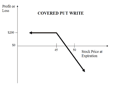 The covered put option strategy explained, with payoff diagram and examples. These are most suited to a bearish to neutral market.
 -
How to Use the VIX
 Knowing how to use the VIX should be essential for all traders whose portfolio of positions may be affected by general market sentiment.
 -
Using Options to Buy Stocks at Discount Prices
 Did you know that you could be using options to buy stocks so much cheaper than if you just went to your broker and simply bought them at market price?
 -
How Option Price Movements Effect Gains and Losses
Knowing about and understanding how options work is a potent arrow in a trader’s quiver. One of the things that people new to options must understand -
When can you trade Forex Options?
The forex market is the largest financial market in the world which works 24 hours, 5 days per week, if you consider the whole world as a single entity. -
Iron Condor Option Strategy
 In this iron condor option strategy we show you the best way to leg into positions safely and also to adjust your positions when they are threatened.
 -
What is a Straddle Option? A Great Delta Neutral Strategy!
 So what is a straddle option and why is it such a great options trading strategy? You don't have to pick market direction and can still profit very well.
 -
The Long Iron Butterfly - Credit Spreads on Steroids
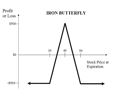 The long iron butterfly is a range trading strategy and a variation of the Iron Condor. Both these strategies use two credit spreads using both calls and puts
 -
The Distinct Advantage Credit Spreads Are Known For
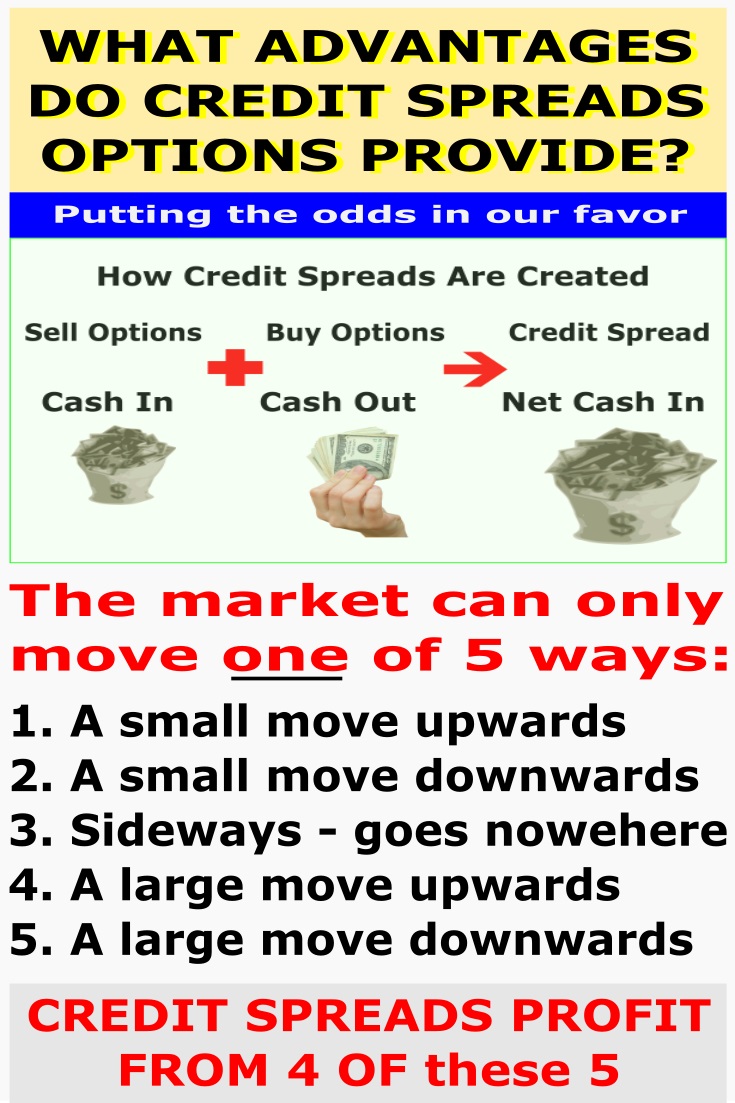 So what is the advantage credit spreads give us? This example will demonstrate how we can turn a losing trade into a profitable one.
 -
Box spreads Illustrated and Explained
Box spreads are an option trading strategy that involves purchasing a bull-call spread with a corresponding bear-put spread. The two vertical spreads have the same expiration dates and strike prices. -
Exotic Options Explained With Examples
Exotic options are typically more complex than regular options. They are most popularly traded on currency pairs but can also be traded on stock options, stock indexes, warrants and commodity options -
Hoadley Options Tools Review
 Hoadley Options Trading and Investment Tools is an Excel based tool that makes options risk analysis easy.
 -
Free Option Trading Software
So we've done some research for you and below, you'll find a summary of some of the best free option trading software available. -
Invest in Soxange and Multiply Earnings through Copying the Top Traders in this Social Network
Within the context of the online trading world, SoXange is one of the few trading platforms that draw all kinds of traders in droves to that online trading

Amazon Affiliate
Copyright © 2002- Options Trading Mastery. ALL RIGHTS RESERVED.
Other Recommended sites:
NaturalRelieved | European Travel Escape | Relationships Guide
New! Comments
Have your say about what you just read! Leave me a comment in the box below.